Thursday, November 19, 2009

Day Eighteen: "Murder Of Crows"


With most of the major structure of the painting in place the final steps are executing the detail, which will make or break the painting.  I'm really into working today and I don't feel much like writing, so I'm just going to show some close-ups of the painting to give you an idea of how it's coming along ...


So far I'm pretty happy with the results.  The hard part has been getting a decent photo of the entire canvas.  These are all a bit blue but the detail is coming across much better than in previous posts.


Paint well...

Wednesday, November 18, 2009

Day Seventeen: "Murder Of Crows"

Coming back to a project after a few days away can be as vexing as it is refreshing...
On one hand I have to re-familiarize myself with where I was with the painting when I left, but on the other I can easily spot problem areas.  The fabric had to go!  That funky inverted triangle was such a block it overwhelmed the entire composition, now I feel the fabric has taken it's place and is lying down.  Also I feel now it may play a more interesting role, I think the white crow will be picking at some threads.  It changes the dynamic of the story.


Along with altering the shape of the cloth, I've worked quite a bit on the background, detailing leaf patterns, locating branches and defining the horizon-line, such as it is.  In this instance I'd say it's the division between the far off bushes and the dirt, about 2/3 of the way up (can anyone say Golden Section?).  NOTE: Horizon-line is a term used in very basic descriptions of perspective.  P.S. NOTE: The Golden Section (AKA: Golden Mean, Golden Ratio, or Divine Proportion) is a mathematical measurement determined to represent the classical point of perfect balance.  Centuries of art and architecture are founded on it's principles.  A technical definition would describe a given line, A, bisected by lines B and C, in such a way that the proportion of C to B is the same as that of B to A...

yeah right!   In a nutshell think 2/3 to 1/3.

I don't have a classic situation here, where perspective comes into play, the space is pretty  shallow, you might even say flat.  What I am using is more a form of atmospheric perspective, where far away objects are faint or bluish in appearance.  Color value (the relative lightness or darkness of a color) can play into this conversation too;  in a simple explanation - warm colors come forward and cool colors recede.  This can get complicated though (...an exception to every rule), try putting a neon blue or green next to a deep purple or maroon and see which looks closer... I'll wait.

Joseph Albers and Johannes Itten are wonderful sources for any color theory studies.

My approach with MOC is to have low value, dark (dull) color in the far background - the upper section of the canvas, and use intense, highly saturated (bright, pure) color in the foreground.  Also I am blurring detail in the distance, and focusing detail up front.  As I said the space in this scene is very shallow so I can't fall back on easy perspective tricks like a distant hill or a sunset.  I have to play with a tightly choreographed color palette, some fuzzy pine needles and feathers... sounds like a date!

Paint well...

Monday, November 16, 2009

Trappings Demo @ Museum Of Northern Arizona


Trappings of the American West is an annual exhibition held at the Museum of Northern Arizona that showcases contemporary artists and craftspeople who work with traditionally Western concepts and imagery.  Artwork and artifacts in the exhibition range from photography to painting and sculpture, to hat making, saddlery (and all forms of leather work), hitching (ropes, quirts, and reins), to knife making, jewelry, spurs, and boot making.  It is an extremely eyeopening immersion in all things Western...

This is the 20th anniversary, I've participated in the past 15 exhibits.


Flagstaff was cold this weekend!  All day Saturday it snowed; a good thing too because it kept people inside... It's hard to compete with the beauty of the snow-dusted San Fransisco Peaks on a clear day!

I have two items in the exhibit this year, an oil painting and a bronze sculpture (seen right).  The painting is a large canvas, 60"X 40", and is titled The Devil Of Doubt (you can see it on the far wall, in the photo above).  I worked on it all this Summer.  I started July 1st and finished just as the show was opening October 10th.

I began with an ink wash study to determine the composition for the oil painting.  Being short on time to complete the painting I set the drawing aside to complete the painting.  I had always intended to complete the sketch, time however wasn't on my side, so with  this opportunity to demo at Trappings, I decided this was my moment...


This is where I left off in July.  The drawing measures 19"X17", the surface is acid free vellum (a durable surface used mainly for architectural drawing), I like it because it really takes a beating (I'd used it years before, working with oil pastel and razor blades, in scratch-board-like technique).  Last year I'd seen a Jasper Johns exhibit at the Art Institute, where he used ink wash on vellum, that was very interesting!!  Inspired by this, I did several large ink wash/pen and ink drawings to great success, so it seemed natural for this sketch to attempt a highly rendered drawing.


Working this type of event is really more PR than actual work-time.  Usually I'm answering questions, selling cards (mostly), prints, and smaller original work.  It's like a trunk show with demos (like the knife salesman at the fair).

Needless to say, I did not finish the drawing (some signs of improvement though).


The idea behind the image is the internal struggle with self-doubt (who me??), hence the title, The Devil Of Doubt.  From this working sketch, the oil painting (seen below) started much like Murder Of Crows did, very abstractly.  Though you'll note how quickly it was recognizable as the finished image.  The major difference between The Devil Of Doubt and Murder of Crows was, knowing where I was going and what out come I wanted.  With MOC I'm following the lead of the canvas and my imagination, unconcerned with the needs of an audience.

Another reason for the quick transition is I wasn't photographing the progress everyday, as I am with the watch-me-work project and MOC...


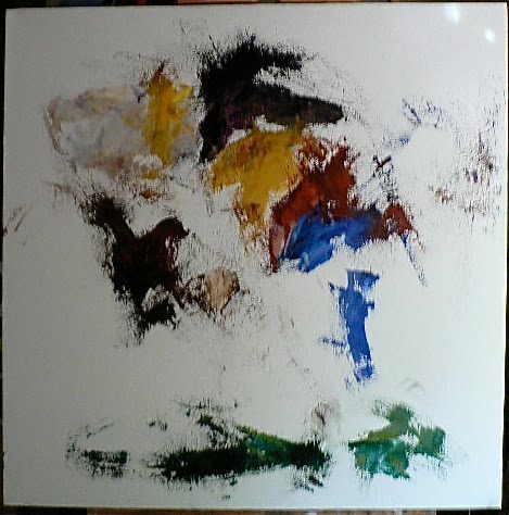
This was the result from the first day of work on Devil Of Doubt.


This, about a week or so into the project.


And this is the completed painting on October 3rd, a bit over three months later...

In a brief comparison, there are few similarities between this project and MOC.  There are the obvious ones, like I did the work, and they are both oil on canvas (duh!!), and from the very start they take an abstract approach.  Though given this commonality, immediately you can see focused delineations appear in the day-one DOD canvas to the right.
Whereas here, on the first-day MOC canvas, the large part of the forms are left as negative space.  In strong contrast there really are no solid painted areas to be seen, and there are clearly no spaces defined with hard edges as in the DOD canvas.
It is not until this day-five MOC canvas, that you see as much organization as the day-one DOD canvas.  Though the forms are largely vaporous, some linear delineation is seen and a few of the forms are becoming recognizable and settling into place.
It is interesting revisiting old projects and comparing completed work with current work.  In a way it is learning from yourself.  Possibly re-learning from, and not remaking mistakes...

Also it's a way of recognizing where you've been, and how far you've grown as an artist.

Paint well...

Friday, November 13, 2009

Day Sixteen: "Murder Of Crows"

Good Morning,

There is so much going on lately it's difficult for me to maintain my focus.  Among other things, this weekend I'll be up in Flagstaff at the Museum of Northern Arizona as the artist in residence (for lack of a better term) at the Trappings Exhibit.  I'll be talking about my work in the exhibit, demonstrating ink washes and pen and ink drawing,  and selling my prints, posters and notecards...

Art isn't always just about painting...

                                                          (there's that money thing).


The past few days I've been fleshing out the background in a subtle attempt to emphasize my circular composition and further define the wooded setting.  I'm pretty much following the lead of the painted surface to formulate the leaf patterns, branches, and ground coverings, keeping in mind that these elements should not over power the crow figures.

Taking the lead of the surface in this manner allows the background to look more as though it grew into place.  When I think about how I'm painting natural patterns they tend to look forced; being random is ... well, random.  Likewise, when horizontal and vertical  lines are parallel to the edges of the canvas they tend to look static, so I've tilted the posts in on each other a bit to add some whimsy.  I haven't decided how to negotiate the fabric... that puzzle will have to live a few more days.


With this close-up you can see there are some details starting to emerge.  I'm hoping to maintain the painterly aspects of the brushwork, rather than over compensate my way into photo-realism.  I'm slowly focusing the details over the entire surface until I am satisfied with the image.  In the past I've pretty much started then completed one area at a time, working my way across the canvas.  This free-range style of painting is refreshing!

Paint well...


Tuesday, November 10, 2009

Day Fifteen: "Murder Of Crows"

Today I thought I'd just take a walk around the canvas and see what's going on that I like and don't like...


As you can see the characters are all finally in their places (for the most part).   Redrawing the fifth black crow has brought him from behind (and looking like a penguin) to a more involved position.  Now he looks to be a part of the action and is holding his own in the overall circular composition.  However, I still am not completely settled on the shape of the fabric.  Moving this crow forward has interrupted the reference back to the original sketch, in effect cutting off the right hand.  I've attempted to readjust the shape, but I don't like the result... so far.
It just seems predictable.


One thing I am very pleased with is the color pattern developing in the bush shape.  NOTE: I've just realized that if you double-click on these detail images they will expand to a greater size allowing you to view the brush work really closeup...COOL!

On my latest junking foray I found another great selection of art books; (most exciting!!) the 1987 MOMA, Paul Klee exhibition book... all 344 pages; and an Oxford Press, Matisse, by Nicholas Watkins from 1984.  I'm not usually that into Matisse, but with this book I realized I'd only been looking at the images that are most published.  This book has quite a few landscapes that I've never seen; and seeing them alongside the old standards, has given me cause to reexamine his work.  One quote that has caught my attention is:

"Seeing is of itself a creative operation, one that demands effort... the artist must see all things as if he was seeing them for the first time.  All his life he must see as he did as a child."

I thought this quote fit my current situation with this project rather well, as I've more than once talked about really looking at what your looking at.  Though I still haven't come to a conclusion about how to really look at what's in your head...


These last few images will give you an idea of how the surface is building up as the painting progresses.  You may recognize some landmarks from earlier posts that are still visible here (like the signature marks from the wallpaper brush).  Another thing to look at is the variation in texture.  See if you can recognize the difference between the impasto marks made using a palette knife and the mark of brushwork, then look for drips and washes of thinned paint.  All of these textures add interest as well as depth in your painting, because heavy texture will come forward, smooth texture tends to recede.
 Remember though, there are no rules!
If you look closely, you'll notice I've purposefully been leaving the black crow forms smoother than the heavily textured bushes... my attempt will result in a kind of optical illusion were the crows will look darker and out of context from their surroundings.  Kind of a comment on the story I'm telling, you know the in crowd picking on the supposed 'outsider'... whose the weird one?

Paint well...

Monday, November 9, 2009

Day Fourteen: "Murder of Crows"

I suppose by now you've figured out my "days" are a bit longer than 24 hours...

I took a side trip to the Colorado River, visited my relatives and got away from my painting for a breath of fresh air.  I've always been impressed with the Colorado river basin along the Arizona-Nevada state line; the landscape there is a fantastic melange of rock and sand, that artistically falls somewhere between Salvadore Dali's fantastic worlds and Leonardo DaVinci's background in the Mona Lisa.  In one particular area just East of the Hoover Dam, looking West in the afternoon, the Colorado River twines its way between craggy, vapid, pale indigo shadow forms.  I've always wanted to costume a model, and photograph her holding an ornate gold frame in front of this scene... the resemblance to DaVinci's painting is uncanny.

 So back to painting!!

I have this theory that you can achieve a likeness of an object not by meticulously copying it point by point, rather by deciphering the lines and patterns that abstractly make up its being.  It may sound weird, but when you look at someone or something that you know very well from a distance (say from 100 yards) you really cannot see details.  What you do recognize is body language and color patterns, or as I would describe them; gesture (or line), and pattern (or shape, remember you cannot have color without shape).

Think of this as a rephrasing of the way you think you look at something; a twist on the paint what you see not what you think you see "rule".  When you look at someone's hair for example, you cannot possibly paint each strand on a person's head (take a photograph!!).  However if you look at the pattern and draw loose, long, open S-curves, varying the closeness and arrangement, you can achieve a likeness of hair. This is a simplistic example but taken to the extreme some amazing results can be achieved.  Look at Matisse and his patterned interiors and landscapes.

These examples to the right are some patterns I've been looking at to help me with this painting.  I find that when painting nature patterns, like trees, and leaves, and even clouds, you don't have to draw every leaf (or even every tree), as with the hair example used earlier, if you decipher the pattern, and translate it in your own way, the object will  be identifiable.  Then taking a cue from Matisse, try varying the size of various patterns, or flip them mirror image for interest.  The idea is to convey the feeling of a tree or a bush; you could even see feather textures in cloud patterns, or the profile of a crows back in a mountain range.

Experiment.

Paint well...


Wednesday, November 4, 2009

Day Thirteen: "Murder Of Crows"

Day Thirteen... Always an ominous number, though personally I've always had my worst luck the day after the Thirteenth.  I recall that Saturday the Fourteenth when I was about 10, when in the midst of a ferocious acorn throwing war (harmless enough right?) I got smacked in the face with a coke can (before they were aluminum) and got a few stitches in my upper lip. Hence the life long mustache!!

Enough drama.  Life always has it's little humps to get through, over and around, and like water finding it's own level, things just manage somehow to get where they are going.

Like it or not.

Taking a moment to look at what I've got going so far with the painting.  I like the overall color-palate developing (that's the combination of built-up color, over the underpainting).  It is deepening into a muted-glowing-gray, mystical, moody scene. I also like the black of the crows (a combination of indigo, dioxazine purple, ultramarine, paynes gray and vandyke brown. With some highlights of kings blue, mineral violet and celadon).  I'm not as happy with the fabric or the white crow (he's going to be much more albino-y).  And I really need to work on the space as defined by the fencing.  But hey, it's a start!

So the work at this point is to place all the components of the composition, define their shapes, and make clear their activity or purpose in the story I am trying to tell.


Overall, I want to design the space by some specific choices I have made for this painting.  I do not want any of the elements to extent out side the canvas edge.  Because of the square shape of the canvas I want a circular motion to the composition (circles tend to work best in squares).  With this  circular motion I want to be true to my original sketch of the three figures AND the abstracted layout sketch from day nine.  I'm not saying I've achieved any of these goals as yet, they are goals and as such I may succeed or I may fail.  I guess that is why they call an artist's work their "Practice", much like a doctor's work is called a "Practice" (though I'm still uncomfortable describing what I do as "Practice"... it just sounds so removed and remote.
Wow, they're right!).

One good point to remember at this stage of painting is that no part of what's been done is too precious.  Don't sacrifice the composition for a little dreamy-delicious spot of brushwork.  I was really enamored with some areas of the background that had to be sacrificed with moving the foreground crows and developing the negative space between them.  I think the resulting activity is a better choice.


From here it only gets better!

Paint well...